
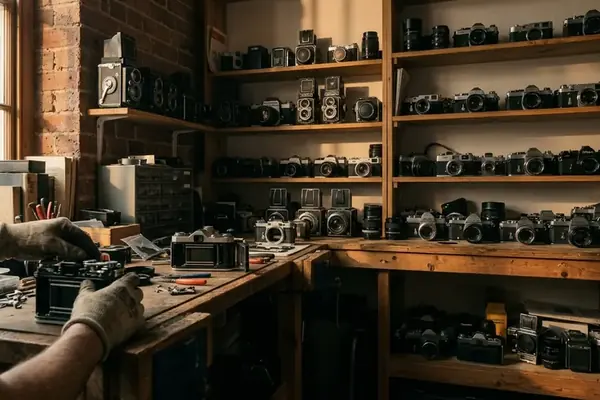
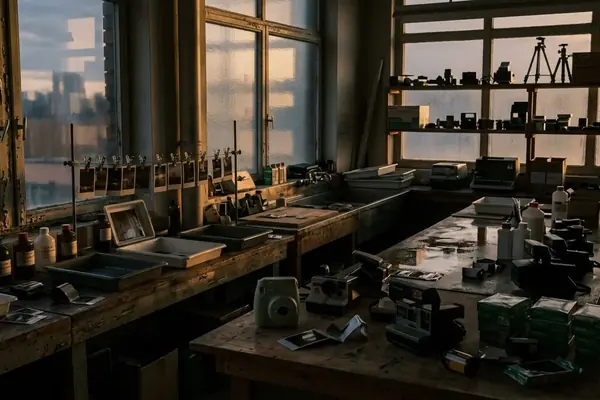
Retro photography gives digital memories a physical language: soft color shifts, generous instant-film borders, handwritten captions, and paper that invites handling. Vintage cameras supply the visual cues, yet a modern phone image can carry the same mood when crop, tone, grain, and print finish work together.
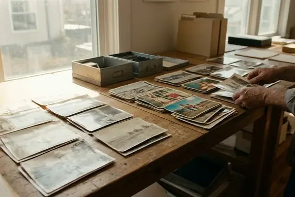
Begin with photographs that already hold a clear subject and a readable moment. A quiet edit usually travels farther than a heavy preset: lift faded shadows gently, warm or cool the color cast, and add grain without burying eyes, faces, or fabric texture. Set the crop for the chosen border before refining the image, since instant-film-inspired layouts can take useful space from the frame. Print one test on the intended paper and inspect it in ordinary room light. Matte stock often suits a softened, handmade mood, while gloss gives dark tones and saturated color more punch.
Then build a small sequence with repeated border widths, caption placement, and color treatment across the whole coordinated set. Mix close details with wider scenes so an album page or wedding display can breathe. Use photo-safe corners, sleeves, or mounts, and keep decorative tape away from the image surface. Store finished prints away from strong light and damp spaces; a nostalgic finish should age by design rather than by damage. The decisive production fact arrives before any border, caption, or faded palette: pixel dimensions determine how much image detail reaches the paper.