Evaluating the Wet Print and Establishing Core Grading Pillars
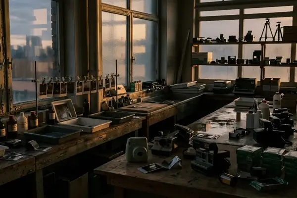
Under the safelight, the print is lifted from its final bath, washed, and carried into viewing light. A magenta cast remains in the deepest dress folds rather than disappearing with the wet sheen. That observation sets the grading order for any digital file intended to replicate the analog process. Establish a slightly lifted black point, add controlled halation around bright areas, and then shape the shadow and highlight hues. Those three decisions form the foundation of an authentic analog look.
The transition from chemical bath to daylight reveals the true nature of the photographic print. The initial assessment requires patience. Let the washed print surface settle for 30–60 minutes before judging shadow color. Wet gloss makes blacks appear denser than they will when dry. That waiting period matters for establishing the core grading pillars. A lifted black point is the first critical adjustment. For an 8-bit working file, an output black point near 8–15 is a practical proofing range for faded blacks, provided the darkest important detail remains visible. This adjustment creates the characteristic faded look of vintage prints, and it must be balanced carefully so essential shadow details stay readable.
The second pillar involves controlled halation. This effect mimics the way light scatters through the layers of analog film. At 300 pixels per inch, a workable highlight-glow radius starts at roughly 4–9 pixels. That measurement is equivalent to about 0.3–0.8 millimetres on the physical print. Confine the effect to specular highlights and bright window edges to maintain structural integrity in the midtones. Applying the glow selectively prevents the image from appearing uniformly soft. The final pillar is the shaping of shadow and highlight hues, which brings the chemical signature to life.
Mapping the Chemical Signatures of Analog Film Stocks
Choose the chemical profile from the intended memory rather than from a preset name. A sunlit family scene takes a red-and-yellow highlight bias associated with classic warm color-negative materials. A cooler portrait uses restrained green in the midtones and magenta in the shadows. Check the grade against neutral objects so the chemical signature reads as film character. Chromogenic color film normally uses blue-, green-, and red-sensitive layers that form yellow, magenta, and cyan dye images respectively during development. Those dye clouds overlap—creating the final image rather than reproducing the discrete RGB sampling pattern of a digital sensor.
Photographic-conservation guidance from a specialist image-permanence institute, though primarily focused on archival storage rather than creative grading, separates light fading during display from dark fading in storage. Illumination and ultraviolet exposure dominate the first category. Temperature, relative humidity, and airborne pollutants materially affect the second. Reviewing photographic dye stability and color shifts provides a framework for understanding these degradation patterns. A film family alone cannot predict an aged print's exact hue. Processing chemistry, paper, storage humidity, display light, and later scanning outweigh the stock's original tendency.
Evaluate a simulated aged shift under the intended room lighting for 10–15 minutes and compare it with a neutral viewing light near 5000 kelvin before approving the proof. That check confirms whether the chemical signature translates to the final print. Yellow, magenta, and cyan dyes interact as a complex color matrix, and understanding that matrix is essential for authentic reproduction. Temperature and humidity work on each other over decades to produce specific color shifts. Replicating those shifts requires careful observation and precise digital adjustments.
Isolating Hardware Contributions from Post-Processing
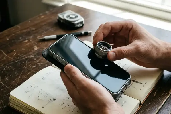
Isolate the hardware contribution before color grading. Fix the camera on a tripod, lock white balance and exposure, and photograph the same backlit subject through a vintage lens and a modern reference lens at the same aperture. Run the lens comparison at f/4–f/5.6 with an unchanged shutter speed, sensitivity setting, focus distance, and white balance. Place a bright lamp or window just inside or immediately outside the frame to expose veiling flare.
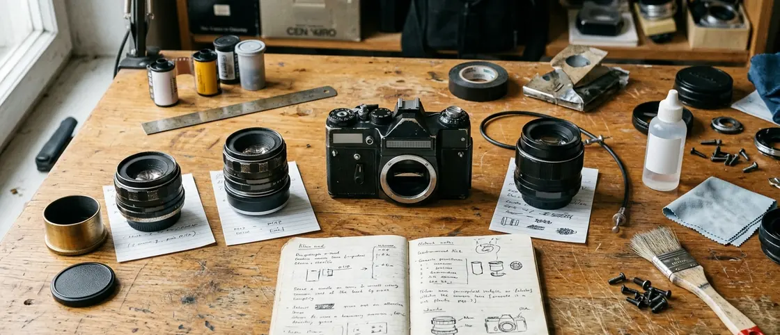
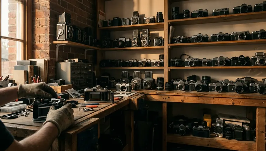
Uncoated and single-coated elements scatter oblique light across the image. This optical behavior lifts local blacks and reduces separation between nearby tones. Map localized color casts with a separate seal test. Inspect two or three sacrificial frames after a 20–45 minute daylight handling test. Light entering through a deteriorated rear-door seal often produces red or orange fog because it passes through the colored film base. Front-side leaks appear pale, white, or less strongly colored.
Mapping the Orange-Edge Boundary
Rear-seal fog may be recreated as localized base-filtered light. Avoid applying a global orange wash across the entire frame based on a single edge leak. Isolate and understand the hardware contribution first, then grade. Uncoated elements scattering oblique light produce a specific visual effect, and that effect takes careful analysis to replicate. Sacrificial frames give you a practical way to map localized color casts — and telling a rear-door leak from a front-side one is what keeps the reproduction honest.
Preparing the Digital File for Physical Output
Resize the digital file to its final print dimensions and soft-proof with the printer-and-paper profile. The scaling has to be exact. For a 10 × 15 centimetre print prepared at 300 pixels per inch, use a file of approximately 1181 × 1772 pixels. Apply sharpening and grain only after reaching those final dimensions.
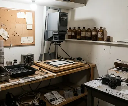
Adjust the tone curve before color. Start with the black output level around 8–15 on a 0–255 scale. Place a second curve point in the lower midtones to prevent faces, dark suits, and hair from becoming uniformly gray. Add highlight compression only where glow is wanted. Apply split toning to mimic chemical color shifts. Keep warm highlights and cooler shadows subtle enough that neutral clothing still reads as neutral.
Match digital grain to the luminance of the image. At 300 pixels per inch, grain clumps measuring roughly 2–4 pixels produce a printed texture of about 0.17–0.34 millimetres. Reduce grain in bright highlights and deepest shadows so it follows image luminance. Allow an inkjet proof to dry for 12–24 hours before making the final density and color decision. Inspect it under the lighting in which the finished print will normally be viewed.
Print-Proof Preparation Checklist
- Resize the file to the exact physical print dimensions.
- Load the printer-and-paper profile and enable soft proofing.
- Lift the black endpoint while preserving important shadow detail.
- Warm selected highlights and cool selected shadows without tinting everything.
The Tactile Reality of the Finished Photograph
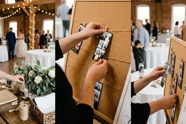
Place the dried proofs side by side. Select the version with readable black fabric, restrained amber highlights, and fine midtone grain. Use a matte or lightly textured surface for the final proof. Leave a 3–5 millimetre white border if the print will be handled or placed in a scrapbook. Complete the final comparison after the 12–24 hour drying interval. Check skin, white fabric, shadow detail, highlight glow, and border cleanliness in one viewing session. Judge the finished print at a normal hand-held distance of roughly 30–45 centimetres.
The bride lifts the 10 × 15 centimetre matte print. She traces the softly rendered grain around the edge of her veil and pauses over the warm flare beside the window. The photograph carries the softened, physical weight of a preserved memory.