

Shape the vintage mood
Learn how warm shadows, restrained contrast, soft flash, and familiar square crops give digital photographs an analog character.
Explore retro photography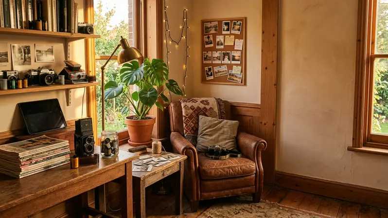
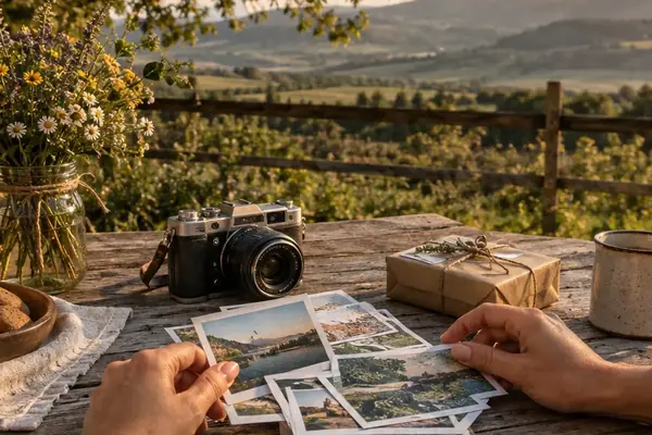
Photographs belong in your hands, not trapped behind a screen. Reclaim the tangible memory.
Explore retro photographyMost camera rolls contain thousands of pictures and only a handful we revisit. Printing creates a natural pause. You choose the laugh worth keeping, the imperfect holiday morning, or the quiet kitchen-table portrait that became more meaningful with time.
Learn how warm shadows, restrained contrast, soft flash, and familiar square crops give digital photographs an analog character.
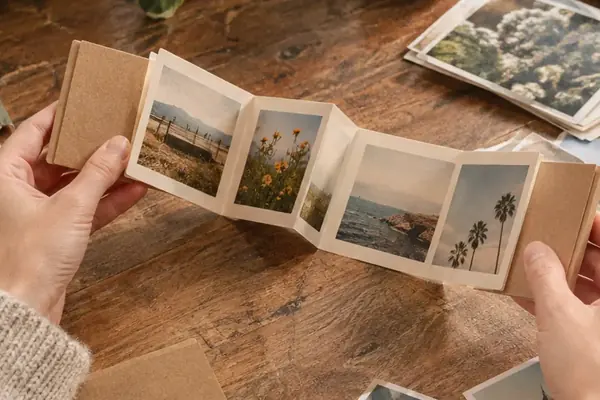
Explore retro photographyTurn small prints into garlands, place cards, keepsake boxes, and gifts that still feel personal after the celebration ends.
Browse photo craftsBuild albums and displays from ordinary scenes: muddy shoes by the door, Sunday breakfasts, new homes, and growing families.
Start preserving memoriesWhich images should you print first? Begin with the ones that carry a story, even when the lighting is uneven or someone moved at the wrong moment.

A tight edit works better than sending an entire month of nearly identical frames to the printer. Pick one wide scene, one close expression, and one small detail. That simple sequence gives a scrapbook spread or wall arrangement a beginning, middle, and end.
Square and instant-style formats often trim more from the sides than expected. Keep faces, hands, and handwritten signs away from the outer edge. For group pictures, add breathing room around the people before applying a border.
One practical rule saves trouble: review every crop at its intended shape rather than trusting the original phone preview. A strong photograph can lose its balance when a square crop cuts through an elbow or removes the doorway that explains the scene.
Beginners often reach for one uniform stack of square prints. That is a dependable start, especially for gifts and compact albums. As the collection grows, mixed formats can add rhythm without making the display feel busy.

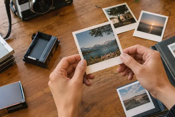
Use square prints for portraits, pets, food, and centered compositions. The generous lower border can hold a date or a short handwritten note.
Photo strips suit expressions that unfold across several frames. They work particularly well as wedding favors, bookmarks, and narrow shelf displays.
Choose a wider format when the room, horizon, or street matters as much as the person in it. These images anchor a mixed gallery wall.
Advanced displays feel cohesive because something repeats: a cream border, warm color grading, similar spacing, or one recurring frame material. The photographs can span decades while that visual thread holds them together—an especially useful approach for combining scanned family pictures with recent phone images.
Further Reading: See how format, spacing, and color work together in our guide to curating a cohesive gallery wall.
A finished print should live where people can encounter it. Prop a small portrait against a stack of books, clip a seasonal row above a desk, or place a rotating selection in a shallow wooden tray.
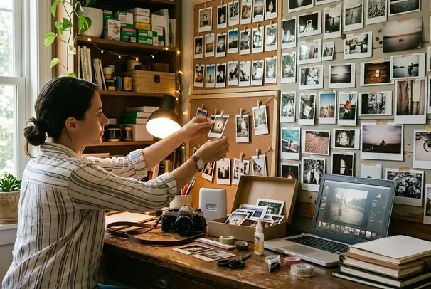
Start with one visible place and change the photographs when the season, household, or story moves on. Albums protect longer narratives; open displays keep individual memories in daily view. Both approaches reward simple materials and enough space around each image.
The choices that decide how a print feels are physical ones: crop, paper shape, sequence, placement, and care. Retro tone, handmade keepsakes, and wall arrangements all follow from those few decisions made at home.
Look through the latest twelve pictures on your phone: which single frame would you choose to hold in your hands tonight?