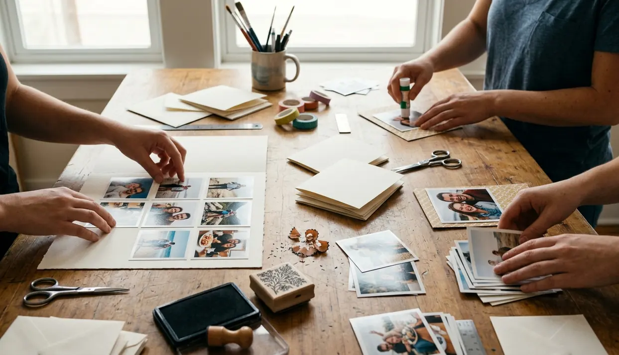
A save-the-date carries a deceptively small assignment: make one future day feel real. A square retro print does that with unusual economy. The photograph creates the emotional pull, while a narrow set of details gives guests enough information to act.
The format also rewards discipline. Strong versions depend on a few controlled choices: a photograph composed for a 1:1 frame, no more than two typefaces, and cover stock rated at 300gsm or heavier. When those pieces agree, the card feels like a keepsake before the wedding has even begun.
From Public Notice to Personal Photograph
Traditional newspaper wedding announcements recorded an engagement or marriage for a broad audience. Save-the-dates serve a more intimate purpose. They ask a chosen guest to reserve a specific day and begin imagining the celebration.
That shift explains why announcement-style prose feels stiff on modern wedding mail. A photograph communicates the couple’s character faster. The familiar instant-photo silhouette adds nostalgic intimacy, and its simple geometry leaves little room for distracting decoration.
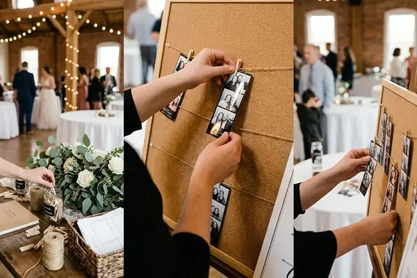
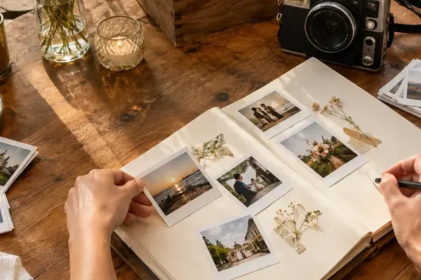
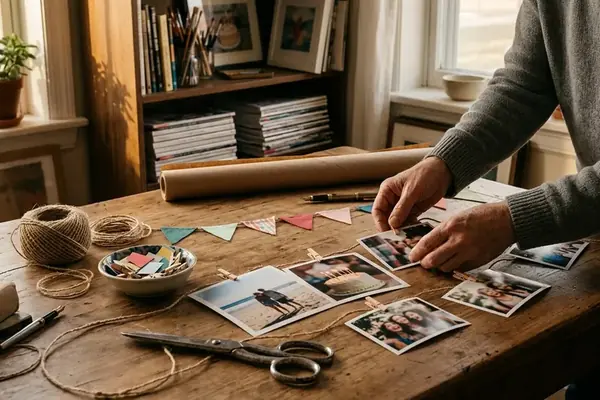
Square retro prints suit image-led save-the-dates particularly well. They combine the warmth of retro photography with the visual restraint expected from contemporary stationery, and the design moves easily into later wedding inspiration: the same layout can reappear in reception print displays, place cards, scrapbooking pages, or an instant-print guest book.
Timing still matters. Couples generally plan to send save-the-dates roughly six to eight months before a local wedding. A celebration involving substantial guest travel calls for eight to twelve months. Working backward from that mailing window keeps photography, proofing, and envelope testing from colliding at the last minute.
Finding a Square Inside a Wider Portrait
Test the Crop Before the Expression
Which engagement photograph works best? The answer often changes as soon as a square frame is placed over it.
Most cameras and phones produce rectangular files. A 6000 × 4000-pixel 3:2 landscape photograph cropped at full height becomes 4000 × 4000 pixels, removing 2000 horizontal pixels in total. Crop a 4000 × 3000-pixel 4:3 file the same way and it lands at 3000 × 3000 pixels, losing 1000 horizontal pixels. A charming gesture near an outer edge can disappear quickly.
Shortlist photographs by applying the 1:1 crop first. Move the frame laterally to protect faces, hands, and the direction of a glance. Then inspect the space left around the couple. The winning frame should still feel open after the white instant-print border enters the composition.
Let the Photograph Breathe
Negative space carries real weight in this format. A close portrait that looked energetic in a wide frame may feel boxed in as a square. Off-center figures, an open stretch of sky, or a quiet section of wall give the border somewhere to settle.
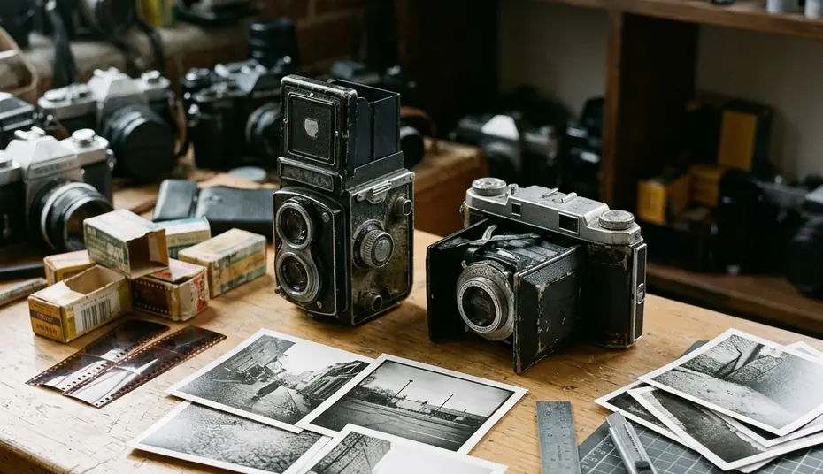
Candid photographs usually suit the retro character better than formal poses. Slight motion, an interrupted laugh, or a glance away from the camera echoes the accidental charm associated with instant film and mobile photography. The goal is relaxed specificity rather than manufactured vintage effects.
Resolution leaves generous room for many originals. A 5 × 5-inch print needs at least a 1500 × 1500-pixel file for output at 300 pixels per inch; a 6 × 6-inch print needs at least 1800 × 1800 pixels. Complete crop tests a week or two before the print order is due so a missing high-resolution original does not force a rushed substitution.
Turning the Bottom Border Into a Caption
The weighted lower margin is the square print’s most useful design feature. It provides a natural caption field without covering the photograph or adding a separate information card.
Set the image first. On a 5 × 5-inch card, a practical arrangement uses a 4 × 4-inch image, 0.5-inch side margins, a 0.25-inch top margin, and a 0.75-inch bottom margin. That lower border has enough depth for a clear reading order: names, full date, city, then one short wedding website URL.
Choose Type That Can Stay Quiet
A neutral sans-serif gives the print a clean editorial edge. A restrained typewriter face pushes it toward a more obvious vintage mood. Both work because their shapes remain legible at small sizes. Elaborate scripts bring fine strokes and decorative capitals into an already compact space, often competing with the photograph.
Names and the date can sit around 12 to 18 points. The city and website can step down to roughly 9 to 11 points. Keep every line at least 0.125 inch from a trim edge, and judge the hierarchy on a physical print. A screen enlarged to around 200 percent conceals spacing problems that become obvious in the hand.
Keep the Border Spare
Limit front-facing copy to names, the date, the city, and the website. Venue details, schedules, and travel notes belong online.
Allow something like three to seven calendar days for two or three physical proof rounds. Each proof should test actual reading distance, trim accuracy, and the balance between the photograph and its caption.
Choosing Stock That Feels Like a Photograph
Thin paper weakens the illusion immediately. Specify cover stock rated at 300gsm or heavier to approach the rigid feel associated with instant film. Ask the printer about caliper and feed limits as well, since two papers with the same weight can differ in thickness and stiffness.
Matte Versus Semi-Gloss
Matte stock gives skin tones and shadows a softer, art-print finish. It resists glare and tends to sit comfortably beside kraft paper, linen textures, and other understated wedding materials. Semi-gloss produces denser color and more closely resembles a traditional photo-lab print, though fingerprints and reflected light become more visible.
Paper samples settle the comparison better than descriptions. Request them a week or two before placing the production order, then print the same photograph on both finishes. Compare shadow detail, skin tone, glare, and fingerprints in daylight.
For a 5 × 5-inch card, test an envelope with about 0.125 inch of clearance on every side. An inner size of approximately 5.25 × 5.25 inches usually protects the edges without letting the card slide excessively. A textured kraft outer envelope strengthens the handmade mood; translucent vellum works well as an inner sleeve when the photograph should appear gradually during opening.
Let finished pieces dry or acclimate for a day or so before stacking, sleeving, or inserting them. This modest pause helps protect printed surfaces during assembly.
Pricing the Square Envelope Before Mailing Day
Square mail creates a practical trade-off. Its silhouette completes the retro print concept, yet the same shape falls outside the standard machinable proportions for domestic U.S. letter mail.
Build one finished sample with the card, sleeve, envelope, seal, and every insert. Take that exact piece to a postal counter a few days before the bulk mailing. Weight, thickness, stiffness, and shape all belong in the check; testing an empty envelope gives an incomplete answer.
Square-Mail Preflight
- Export the photograph as a true 1:1 crop using the printer’s requested resolution and color profile.
- Check that faces, hands, and important background details remain clear of the border.
- Confirm that the assembled envelope stays within letter-format dimensions and thickness limits.
- Purchase postage covering both the current letter rate and the applicable nonmachinable surcharge.
- Review international destinations separately for local size, customs, and postage rules.
Domestic U.S. letter-format pieces generally must measure at least 5 inches long, 3.5 inches high, and 0.007 inch thick, while remaining no larger than 11.5 inches long, 6.125 inches high, and 0.25 inch thick. Excessive rigidity can also affect classification.
The surcharge reflects handling outside standard sorting machines, which keeps the square keepsake away from the ordinary automated path. For machinability, length divided by height must reach at least 1.3. A 5.25 × 5.25-inch envelope has an aspect ratio of exactly 1.0.